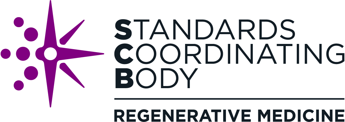
Introducing the New SCB Logo
Since SCB began operations in 2017, we have rapidly grown as an organization and established ourselves as a trusted source of unbiased guidance about the regenerative medicine standards process. In the past year alone, SCB:
More than doubled our stakeholder audience
Received upwards of 60 invitations to speak at events
Received published recognition from the U.S. Senate and House of Representatives and the UK Medicines & Healthcare Products Regulatory Agency (MHRA)
With increasing numbers of regenerative medicine stakeholders looking to SCB for standards coordination and support, we want to ensure that our logo clearly communicates our purpose to new and existing stakeholders. Our original logo shows our connection to the regenerative medicine space, but this is only part of our story. The new logo better illustrates what SCB represents.
Elements of the New SCB Logo
SCB has an important mission of accelerating standards advancement for cutting-edge regenerative medicine therapies through community engagement, coordination, and education. We collaborated with our partners at Nexight Group to develop a logo design that can serve as a strong, rich emblem that could speak to the different sides of our work.
Compass Rose: Our new logo centers on a stylized compass rose, a navigational tool representing not only guidance and coordination but also outreach, exploration, and chasing new horizons. This collection of ideas captures how SCB aligns standards efforts across a broad range of stakeholder groups to open the path to new regenerative medicine advancements.
Coordinated Structure: The left half of the emblem brings several circles inward toward the center of the compass rose, representing the coordination of stakeholders brought together toward a common goal. The right half of the compass points beyond, representing outreach and guidance. The overall structure of the logo is focused and coordinated, while looking outward, much like SCB itself.
Modular Format: The new logo gives SCB room to grow, employing a modular format that allows for a wide variety of use cases. The words “Regenerative Medicine” can be replaced with the SCB process statement of “Engage. Coordinate. Educate.” or can be removed entirely in cases where engaged stakeholders are familiar with SCB or there are layout space constraints. As SCB expands, we also have the option to use this flexible space to convey new focus areas while maintaining our visual identity.
Revisiting our logo has given us a chance to examine who we are as an organization—our priorities, what we stand for, and our path forward. It has been an exciting and energizing process, and we’re eager to share the results with the broader community through the launch of the new logo design.

